Credits
When doing individual research I found the conventional credits for our genre are in sans serif, capitals and in either the colours black or white (depending what is on the screen) Having typography like this makes it easy for the audience to read but it also makes the films stand out because they are bold. I quite liked the credits from the film openings "The Walking Dead" and "World War Z", this is because they easy to read and are simple but effective. Me and my group use these as a guide line.

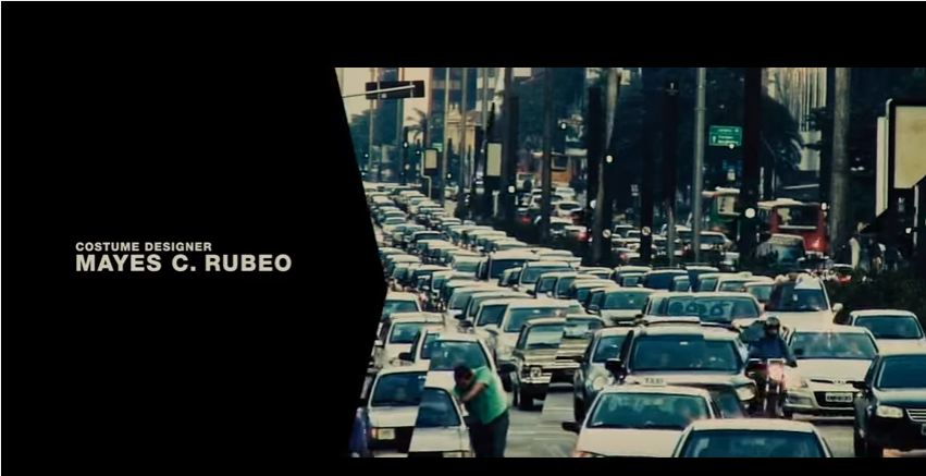

When researching I found the order of credits are about the same for most film openings:
-Distribution company
-Production company
-Actors
-Costume/make-up, Casting, Music etc
-lastly the Director
These show how having the director as the last name you will see makes you remember them, but also having the distribution/production company first also shows how they are important.
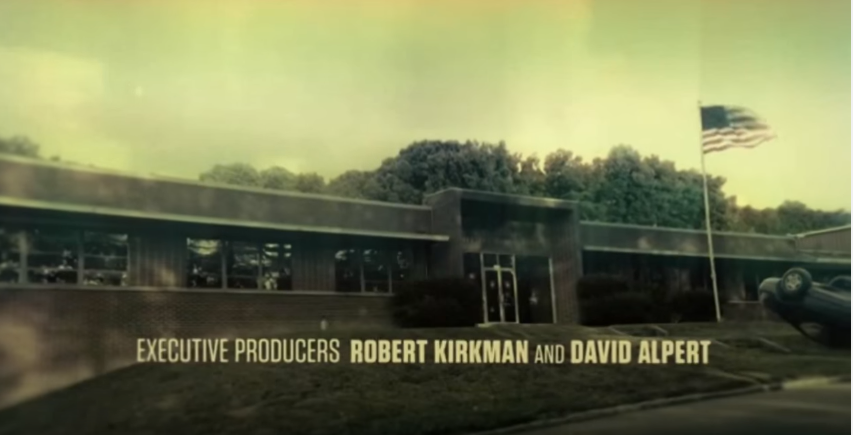
We have taken these to make our own order in credits:
-Production company
-Actors
-Music producer
-Casting
-Costume
-Editor
-Director
-Finally Title

For our title we struggled finding one that was effective, we decided to work as a group to find the best one. After a long discussion we came up with "The Parted", we liked this name because it tell the audience a little bit about the film, it links to the separation of the dead and undead. But also leave it to be mysterious. We did a tally chart to find out which one out of the fonts above, from it we found that the most people (8/12) liked "Living Hell Regular". However just die already wasn't even voted for, this came as a shock to us because as a group we wanted to pick "Just Die Already". This font (living hell regular) was popular because it looks like it has a blood trail coming from it, it is also in capitals and is in bold,one comment we got from it was "It is very zombie like". We felt like it the credits should be different to the font of the title, because we wanted to make the film opening more interesting, to do this we looked back at our research to find most are positioned in different places depending on the film opening, they would also be small but still in capitals. You can see our credit fonts below:
Title
